
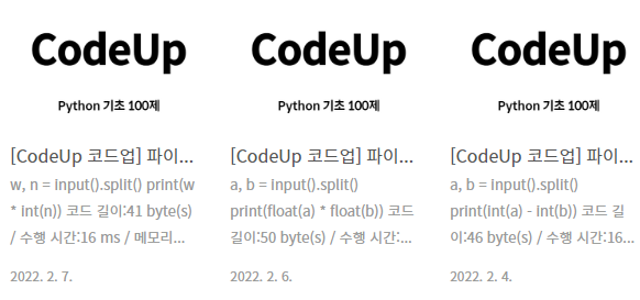
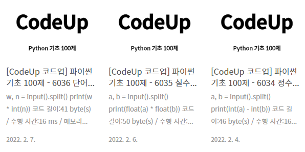
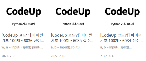
글을 리스트로 볼 때 제목이 너무 짧고 내용은 너무 많아서
가독성을 높이기 위해 제목은 2줄로, 내용은 1줄로 변경했다.
썸네일도 직사각형이 별로라 정사각형으로 바꿨다.
[블로그 관리] - [꾸미기] - [스킨 편집] - [html 편집] - [CSS]
라인의 숫자는 블로그마다 다를 수 있으니 Ctrl + F로 찾는 게 정확합니다.
[CSS] 1165라인 : 글 제목
- Ctrl + F : .post-item .title
- 삭제 : white-space: nowrap;
- 추가 : display : -webkit-box;
- 추가 : -webkit-line-clamp: 2;
- 추가 : -webkit-box-orient: vertical;
▼ 변경 전
.post-item .title {
	display: block;
	overflow: hidden;
	max-width: 98%;
	margin-bottom: 4px;
	padding-top: 9px;
	text-overflow: ellipsis;
	white-space: nowrap;
	line-height: 1.4;
}
▼ 변경 후
.post-item .title {
	display: block;
	overflow: hidden;
	max-width: 98%;
	margin-bottom: 4px;
	padding-top: 9px;
	text-overflow: ellipsis;
	line-height: 1.4;
	display : -webkit-box;
	-webkit-line-clamp: 2;
	-webkit-box-orient: vertical;
}
[CSS] 1177라인 : 글 내용
- Ctrl + F : .post-item .excerpt
- 변경 : -webkit-line-clamp: 3; ▶ -webkit-line-clamp: 1;
▼ 변경 전
.post-item .excerpt {
	display: block;
	overflow: hidden;
	max-width: 95%;
	margin-bottom: 15px;
	text-overflow: ellipsis;
	font-size: 0.8125em;
	line-height: 1.5rem;
	color: #999;
	display: -webkit-box;
	-webkit-line-clamp: 3;
	-webkit-box-orient: vertical;
}
▼ 변경 후
.post-item .excerpt {
	display: block;
	overflow: hidden;
	max-width: 95%;
	margin-bottom: 15px;
	text-overflow: ellipsis;
	font-size: 0.8125em;
	line-height: 1.5rem;
	color: #999;
	display: -webkit-box;
	-webkit-line-clamp: 1;
	-webkit-box-orient: vertical;
}
HTML에서!!! (CSS 아님)
[HTML] 183라인 : 썸네일 이미지 크기 설정
- Ctrl + F : s_article_rep_thumbnail
- 변경 : C230x300 ▶ C250x250
▼ 변경 전
<s_article_rep_thumbnail>
	<img src="//i1.daumcdn.net/thumb/C230x300/?fname=https://blog.kakaocdn.net/dn/ctYdqw/btry7LhO9fv/0wNYQ2F3bRLBcmuFKKa7c0/img.png" alt="">
</s_article_rep_thumbnail>
▼ 변경 후
<s_article_rep_thumbnail>
	<img src="//i1.daumcdn.net/thumb/C250x250/?fname=https://blog.kakaocdn.net/dn/ctYdqw/btry7LhO9fv/0wNYQ2F3bRLBcmuFKKa7c0/img.png" alt="">
</s_article_rep_thumbnail>
썸네일의 가로 길이는 맞는 것처럼 보인다.
이제 CSS를 변경해보자.
CSS에서!!! (HTML 아님)
[CSS] 1148라인 : 썸네일
- Ctrl + F : .post-item .thum
- 변경 : padding-bottom: 60.869565217391304%; ▶ padding-bottom: 100%;
▼ 변경 전
.post-item .thum {
	position: relative;
	display: block;
	overflow: hidden;
	width: 100%;
	height: 0;
	margin-bottom: 5px;
	padding-bottom: 60.869565217391304%;
	background-color: #f8f8f8;
}
▼ 변경 후
.post-item .thum {
	position: relative;
	display: block;
	overflow: hidden;
	width: 100%;
	height: 0;
	margin-bottom: 5px;
	padding-bottom: 100%;
	background-color: #f8f8f8;
}
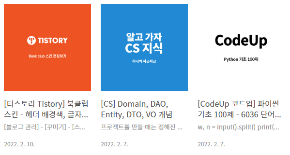
썸네일의 크기는 맞는 영역으로 설정되었다.
사진의 위치를 맞춰보자.
[CSS] 1158라인 : 썸네일 이미지
- Ctrl + F : .post-item .thum img
- 변경 : width: 100%; ▶ width: inherit;
- 추가 : transform: translateX(0%);
▼ 변경 전
.post-item .thum img {
	width: 100%;
	height: auto;
	transform: translateY(-25%);
	-webkit-transform: translateY(-25%);
	-ms-transform: translateY(-25%);
}
▼ 변경 후
.post-item .thum img {
	width: inherit;
	height: auto;
	transform: translateY(-25%);
	-webkit-transform: translateY(-25%);
	-ms-transform: translateY(-25%);
	transform: translateX(0%);
}
이제 썸네일까지 정사각형으로 잘 보인다.
THE END
반응형
'티스토리 Tistory' 카테고리의 다른 글
| [티스토리] 북클럽 스킨 - 사이드바 최근댓글, 태그 없애기 (0) | 2022.02.17 |
|---|---|
| [티스토리] 구글 애드센스 광고 붙이기 (0) | 2022.02.12 |
| [티스토리] 북클럽 스킨 - 리스트 줄 간격, 글자 크기 변경 (0) | 2022.02.11 |
| [티스토리] 북클럽 스킨 - 헤더 배경색, 글자색 변경 (0) | 2022.02.10 |


댓글